"I love creative communication, and have a
special affinity for vintage typography"

This Jordan Gray.
Jordan Gray is primarily a graphic designer and illustrator. He has made an independent film and used to be the editor for a local arts and entertainment paper. He currently works as a Designer and Art Direction for Bernstein - Rein Advertising in Kansas City.
His work has been featured in/on various publications, such as Communication Arts, Print, DesignWorkLife, Grain Edit, Myfont.com, Graphic-Exchange, Gallery magazine, and several others.

I really like this design, I think this design would go well as a cd cover. It has a nice a style and a strong colour scheme. The grey background compliments the yellow monster and makes it really stand out and be eye-cayching. I really like typeface that he has used, it's bold, eye-catching and clear. I think this design is a really strong.

This is an illustration on 'Obesity Brain'. He assembled this out of paper, foam-core and transparencies. Each layer has bits of foam it give it depth, and then he photographed it. I think that it is a really strong piece of work. It is eye-catching, unique and creative. I think that is appropriate for this article and a great piece of work.

I quite like this cute illustration. I find it different and unique to other illustrations. I'm not sure what the purpose of it is for but i find it inspiring. It is simple and even though it doesn't have any text, it is still a strong image and eye-catching to the viewers. I like the colour scheme, light and calm colours. I feel that i could use this colour scheme for my children's menu.

Here is another illustration design. Made up of oranges and apple. At the bottom, it says 'Colour, with a little bit of texture', so i assume that he was just designing this for exercise. I still think that it is quite strong and potentially successful for a certain target market.

I really like this design. It is a film design for the Silver Screen Society - The Third Man. I think the typography here is really clever and really like the layout of the whole design. Black & white compliment each other and helps create the right personality for the poster. I find this really eye-catching and inspiring but there isn't actually that i could use towards my final designs.

This is actually part of a wedding invitation for a musician Dension Witmer and his wife Jennie Noakes. I think that this is quite unique but you can see that Gray has tried to put the personality that Witmer is in the invitation. It's unusual but a strong piece. I like the colour scheme here, its very relaxing yet eye-catching, i feel that i could use these colours in my designs.

I find this illustration truely inspiring. I prefer to use illustrator a lot myself, so seeing images in such detail and looking realistic, is really inspiring. This is an album cover called 'Synchronized Sleeping' for 'Hidden Pictures'. I really like all the different images inside a bookcase. It creates a whole personality for the album cover and for the band.

This is a magazine DPS for 'Medicine + Science'. The image is quite inspiring but was actually illustrated by 'Keith Negley'. The typography that has been used is eye-catching and appropriate for this DPS, and also the layout is very strong, 3 lines of text in the middle is quite eye-catching, especially the text underneath - it catches the curiosity of readers.
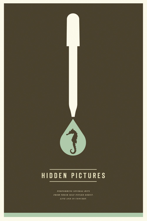
This is a gig poster for 'Hidden Pictures'. I really like this design although i don't quite get what the image means, which i suppose can leave the viewers remembering it better because they would want to know what it meant. Thats what it does for me anyway. I like the simple colour scheme and image however confusing it may be. the layout is very good and creates a great heirachy within the page.

Here is a couple of images to use as examples for a new Ice Cream place called 'Glace'. I really like the brand and the design. I think that it is creative and strong. I could use these bags and a sticker for my project - for a takeaway option.
Thank you again for all the knowledge you distribute,Good post. I was very interested in the article, it's quite inspiring I should admit. I like visiting you site since I always come across interesting articles like this one.Great Job, I greatly appreciate that.Do Keep sharing! Regards, Graphic Designer
ReplyDelete