Here is a list of colour schemes that I chose using http://kuler.adobe.com/.

I chose a light green to give a natural mood. I put this colour in shade, and it gave me 4 more different shades of green. I quite like this colour scheme. It's very calm which would go well with a menu.

I did the same as the above, except i changed it to a light blue. I also like this colour scheme, as its consistent with the same colour, but it makes me think too much of water and not food. This could make my menu not as successful because of the colour.

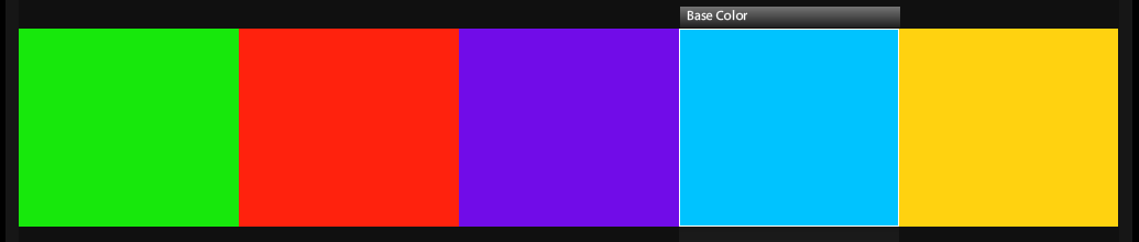
Still with the same colour blue, but instead of being on the 'Shade' option, I clicked on 'Triad' to give me a more contrasting theme. I think this theme is quite bright and energetic. I'm not 100% sure about it though because i think that some of the colours clash together.
This theme is on the same option and with the same blue as the previous, but on the colour wheel, I moved it round to create a brighter colour and more energetic. I like this colour scheme even though it may hurt your eyes a little to look at it. I think it would look good on the children's menu as it would certainly be eye-catching with the colours alone.

I started to think about the adults menu with these colours. I wanted quite a warm and sophisticated feeling for my menu. I find that quite warm colours are eye-catching to adults. I selected the option 'Shade' for this theme so it would give me a range of orange and browns.

I changed the base colour here to the orange, whereas it is brown above, changing the colour then gave me a different shade theme. I like this colour scheme. Its still warm, but adding a touch of red into it.

I clicked on 'Monochromatic' to get this colour scheme. This focus on varied intensity and lightness within a single hue. I think that this colour scheme is quite warm and calming which would work well on a adult menu.
No comments:
Post a Comment